Analytics
The dashboard's Analytics section offers clinicians insights into the LIFECHAMPS patient data. It consists of two primary components:
- Predictive Analytics: This component showcases predictions made by our Clinical Predictive Model for Risk of Frailty. Clinicians can access weekly updated predictions on a patient's frailty status. To view these, navigate to the Patient-level monitoring tab.
- Analytics Monitoring: This offers a detailed view of patient data from digital biomarkers, collected remotely through devices such as Wearable Fitbit, Location Sensors, Smart Scale, and ePROMS questionnaires. This allows clinicians to closely track and evaluate a patient's progress.
This is the main page for the analytics component of the dashboard.
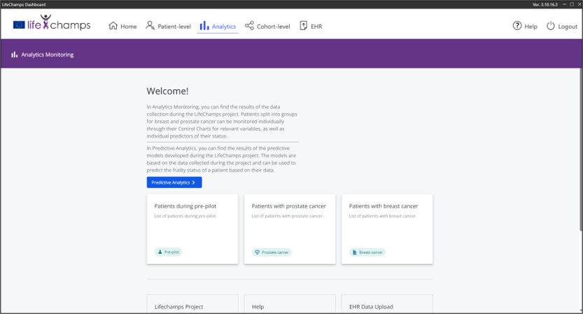
Predictive Analytics
The Predictive Analytics component allows a clinician to get regularly updated, AI-generated predictions about a patient’s current frailty state.
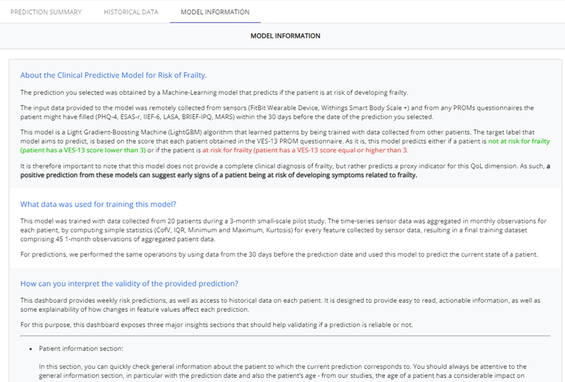
Data from sensors (FitBit wearable device, Withings Smart Body Scale +, Home Location Sensors) and scores obtained for PROMs questionnaires (PHQ-4, ESAS-r, IIEF-6, LASA, BRIEF-IPQ, MARS) are remotely collected for patients in the study.
With this data, the model seeks to predict either if a patient is not at risk for frailty (VES-13 score lower than 3) or if the patient is at risk for frailty (VES-13 score equal or higher than 3).
A positive prediction from these models can suggest early signs of a patient being at risk of developing symptoms related to frailty.
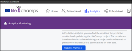
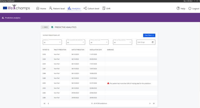
After accessing the Analytics tab, and clicking the Predictive Analytics button, you are presented with a list of patients enrolled in the study.
This list includes basic identifying information about the participant:
- Patient ID: the ID given to the participant to use the LifeChamps app.
- Frailty prediction: prediction of non-frailty/frailty
- Date of prediction: date on which the prediction was made; a prediction refers to the 30-day period before the day it’s made
- Installation date: patient’s study start date
- Warnings: potential warnings about noteworthy aspects of the prediction in question
Participants can be sorted by ID, type of prediction, and prediction can be filtered either by the number of last predictions the user wants to see, or by date range.
By clicking one of those entries, you will be presented with a Prediction Summary Page.
Our Clinical Predictive Models were trained by learning patterns that associate certain collections of digital biomarkers (ePROMs, Fitbit Data, Weight and Impedance data) and their values with a label of non-frailty or frailty.
The purpose of these predictions is to assist the clinician in the decision-making process when monitoring a patient.
Predictions are not 100% accurate. Therefore, clinicians need to validate these predictions in terms of reliability and coherence with the patient’s context.
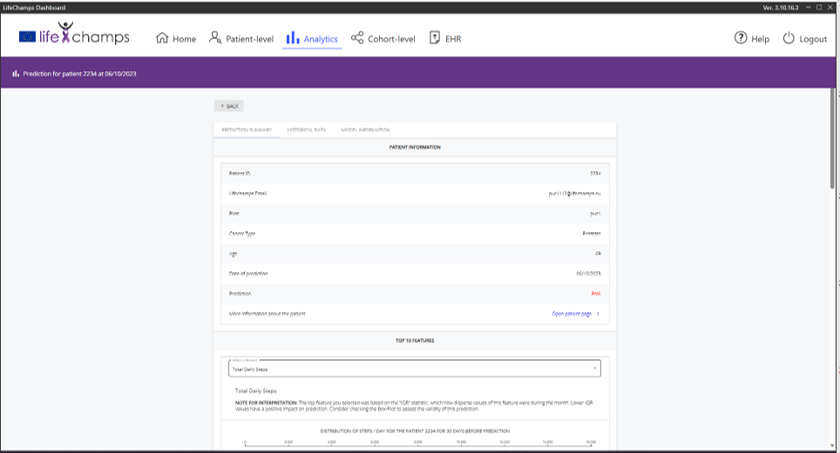
Prediction Summary - General Information
In this section, you can quickly check summary information about the patient to which the current prediction corresponds to.
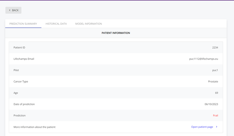
You should always be attentive to the general information section, particularly with the prediction date and the patient’s age (the age of a patient has a considerable impact on prediction: the older the patient is, the more likely for a prediction for risk of frailty is to be made).
Prediction Summary - Top 10 Features
Our model relies more frequently on certain features to make decisions for its predictions. We were able to define the top 10 digital biomarkers used by the model to make its predictions.
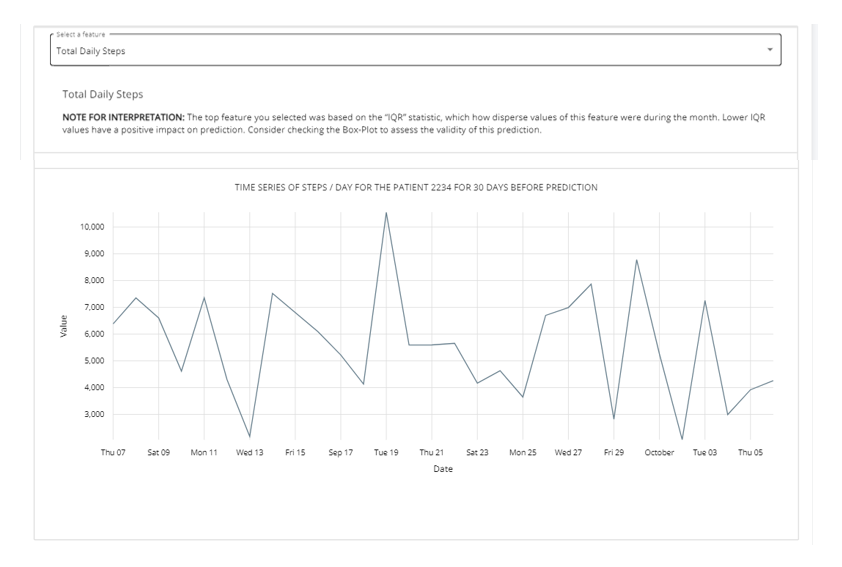
Here, you may consult how values for these top biomarkers evolved in the 30 days before the prediction, to quickly access the most relevant information first, and study the patient’s patterns.
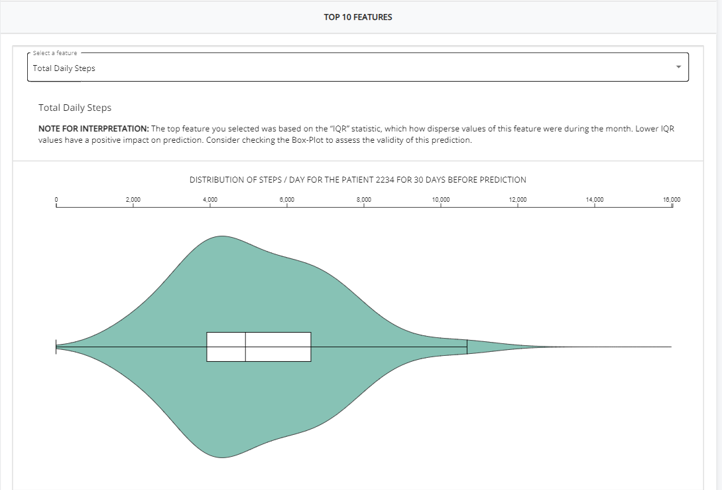
The violin plot shows how values for a specific biomarker were distributed for the patient’s 30-day period. This distribution can be compared visually to the distributions seen by the model during training (plots for comparison in the “Model Information” tab).
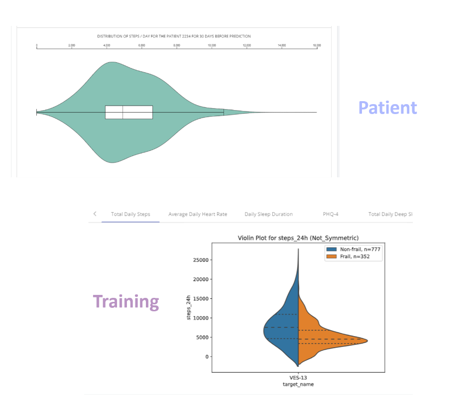
To make comparisons easier and highlight what could be more informative for the plot, a note for interpretation is always provided to guide the clinician in the comparison of the plot with data seen during training.
Additionally, to further consult the patient’s patterns for those top biomarkers, the time-series plot presented below automatically shows the values of the selected feature for the 30-day period.
Prediction Summary - Missing Data Report
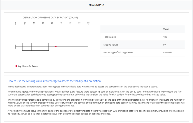
Data used for predictions can be incomplete, often due to issues related with patient adherence (e.g., patient not using the wearable device) or data not being available yet.
This can have a negative impact on the quality of a prediction, reducing the prediction’s reliability.
Here, a clinician might see how much missing data was present when the prediction was made. The plot on the left situates the current patient in the distribution of missing data seen in the model’s training.
Prediction Summary - Providing Feedback
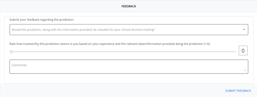
The feedback section serves as a tool for the clinicians to provide feedback about predictions. This interpretation should be related with the usefulness of the prediction provided and confirm if this specific prediction could have an impact on the clinicians’ decision-making process.
The general comments section further allows a clinician to provide any extended feedback about any component of the predictive analytics section of the dashboard, and how they affected (positively or negatively) their interpretations.
Prediction Summary - Historical Data
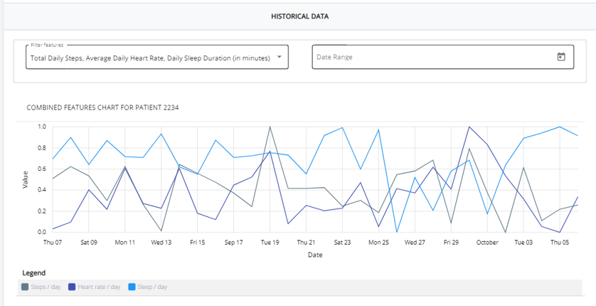
In the Historical Data tab, clinicians can compare the evolution of values for the specific top 10 digital biomarkers used by model for the 30-day period that this prediction considers.
In this tab, the evolution of predictions across time can also be consulted.
Prediction Summary - Model Information
To conveniently recall information about the model that was used, as well as to provide information about data seen during the model’s training, we’ve compiled contents in a model information section that should allow for easy understanding on how predictions should be used, validated, and interpreted.
This is also the section where distributions seen during training can be found.
Analytics Monitoring
You may also want to check simple, general analytic information about the data that is being collected for a patient.
In the Analytics Monitoring page, you can find results of the data collected during the LifeChamps project.
Patients split into groups for breast and prostate cancer can be monitored individually through their Control Charts for relevant variables, as well as individual predictors of their status.
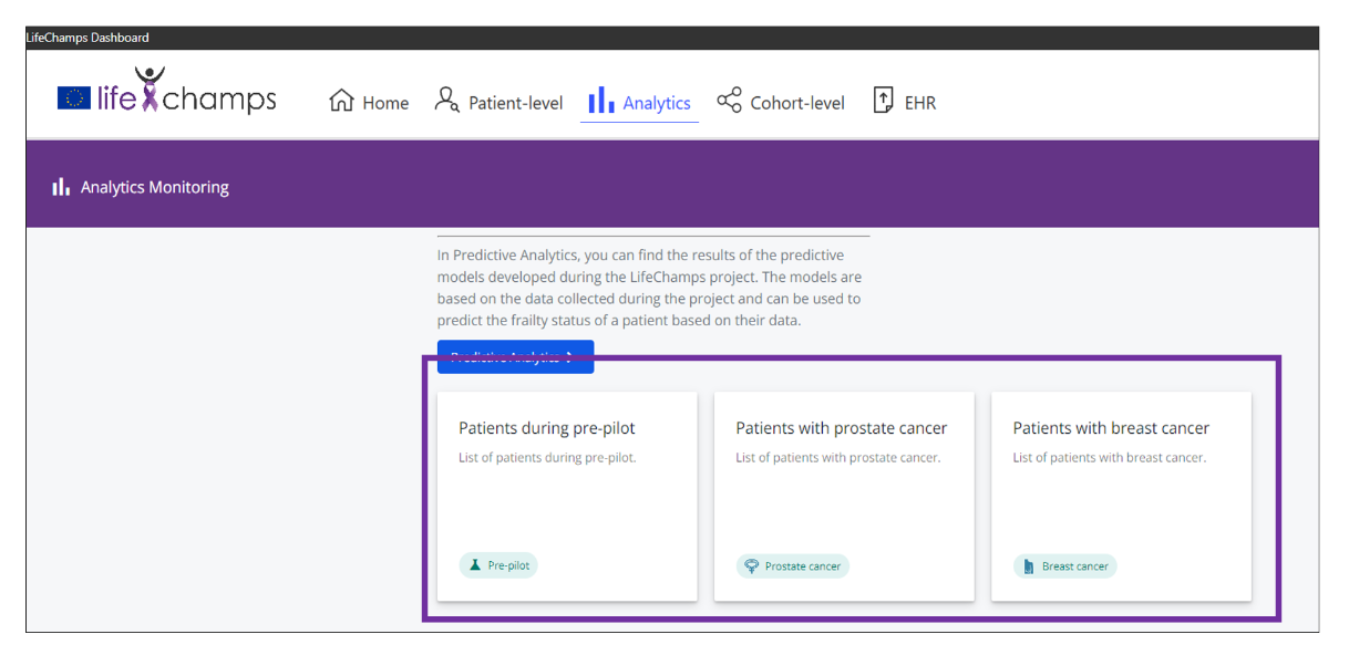
After accessing either one of the tabs, you are presented with a list of corresponding patients
This list includes basic identifying information about the participant:
- Patient ID and E-mail: the ID and contact given to the participant to use the LifeChamps app.
- Pilot: ID of the pilot to which the patient belongs.
- Cancer Type: Cancer Diagnosis
- Installation date: patient’s study start date
As in the previous section, you just need to select the patient for which you wish to see more data. You’ll be presented with 2 major sections: Patient Information and Control Charts.

Analytics Monitoring - General Information
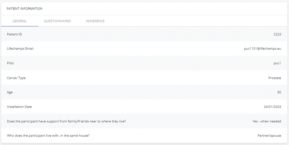
In the first section, a clinician can consult 3 sub-sections, which are: General Information, Questionnaires and Adherence.
In the General Information sub-section, simple information regarding is presented to quickly recall context about the patient.
Analytics Monitoring - Questionnaires
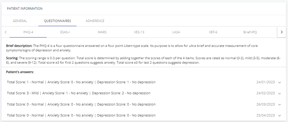
In the Questionnaires sub-section, a clinician can consult answers to ePROM questionnaires (Electronic Patient-Reported Outcome Measures).
Both a description and scoring rationale is presented, to allow for quick recall and interpretation of both the PROMS questionnaire and score for the patient
Below, patient’s scores and answers are presented along with the date where the ePROM was filled.
Analytics Monitoring - Adherence
In the Adherence sub-section, you may consult some indicators that translate how adherent the patient is being.
The number of days that activity was monitored, as well as the number of weight measurements is presented, to allow the clinician to interpret if the patient is being adherent and using the platform’s sensors correctly.

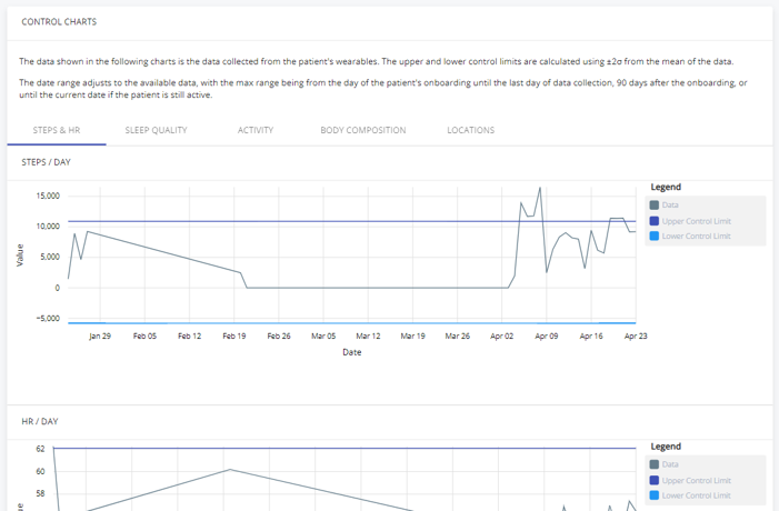
Analytics Monitoring - Control Charts
Just below the “Patient Information” section, you’ll be able to see the Control Charts section.
Here, you can directly study the values and variations for relevant digital biomarkers during the patient’s study period, grouped by interest groups (activity, sleep, body composition, etc….).
